Twitter gonna revamp it’s web design to eliminates the pop-up compose window and brings its look more in line with its mobile apps. Yes! It looks like a tablet ready UI.
Twitter recently updated it’s mobile app for both Android and iOS. Which looks plain and icons are well designed and looked quite awesome.
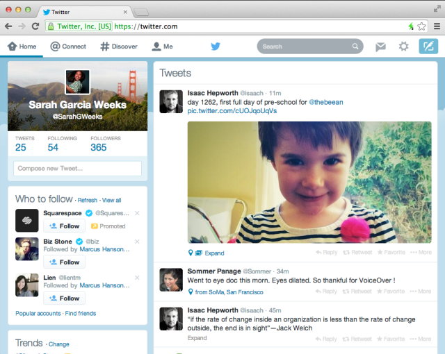
New design looks similar to the past design with a profile box and other information presented to the left of the main timeline. One of the biggest changes in the new one was that there is now an inline compose box on the left side, allowing you to pound out tweets without having to deal with the pop-up compose box.
It feels light weight to have header and other stuffs to the left and the major focus on the tweets.
If some of you are looking at this design and thinking this is how mine has looked for weeks, then congratulations, you’re in one of Twitter’s test buckets. The company experiments heavily, giving 1% of its users a tweaked or refreshed design and testing how they interact with it before rolling out changes on a wider scale.